Designer Unveils Story Behind Pokémon's Iconic Logo Creation
Receiving an unexpected call from Nintendo of America's president isn't something you question—you answer it.
That’s the advice designer Chris Maple received from a colleague in 1998, warning him of an impending call. Maple, who ran Media Design, a Seattle-based firm specializing in urgent, high-pressure projects, was accustomed to such last-minute requests. His company had quietly built a strong reputation with clients like Boeing, the Seattle Mariners, and Holland America Line, often without public credit.
Years into his career, Maple got a call from Minoru Arakawa’s secretary at Nintendo of America, inviting him to their Redmond office to discuss a new game project. Details were sparse, but Maple, intrigued, accepted. Little did he know he was about to play a key role in shaping Pokémon, a global cultural juggernaut.
Bringing Pocket Monsters to the West
“I arrived and waited in their lobby for about 30 minutes, staring at a stunning 21-inch crystal horse head,” Maple recalls of his visit to Nintendo’s Redmond headquarters. “You learn to read the room in corporate settings like that. As the designer, you’re there to solve a visual problem, so I soaked in the atmosphere while gazing at that crystal sculpture.”
Soon, Maple was ushered into a meeting room where a small group awaited. “It felt like an interrogation was about to start,” he says. But when Arakawa walked in, Maple noted his commanding presence. “You could see why he was in charge.”
Maple recounts what happened next:
“Arakawa introduced himself, explaining they were launching a game in the U.S. and Europe. Previous agencies had failed to deliver, burning through budget and time. He asked if I was okay with that, and I said, ‘Sure, but it’ll cost you.’”
“Then someone brought a cardboard box, dumping toys, papers, and strange sketches on the table. I looked at Arakawa, confused, and asked, ‘What’s this?’ He replied, ‘It’s a Pocket Monster.’ I said, ‘What’s a Pocket Monster?’ He answered, ‘It’s Pokémon. We’re calling it Pokémon.’”
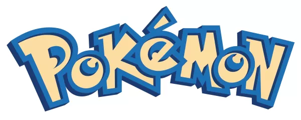
Maple was tasked with creating a new logo for Pokémon, then known in Japan as Pocket Monsters Red and Green. Nintendo planned to launch Red, Blue, and later a Yellow Pikachu Edition in the West, needing a rebranded logo to match the new name. With just one month and no specific guidance, Maple faced a tight deadline to deliver.
The Elusive Crystal Horse Head Mystery
For days, I’ve scoured the internet for traces of the crystal horse head Maple vividly remembers. It was his first impression of Nintendo, possibly influencing his iconic logo design. Yet, no evidence of it exists online. It’s absent from rare videos of Nintendo’s old lobby, which relocated in 2010. Former employees and visitors from that era don’t recall it, suggesting Maple may have visited a private lobby. Nintendo and The Pokémon Company ignored my inquiries, and searches through DigiPen and The Video Game History Foundation yielded nothing.
Update 7:21 a.m. PT: Shortly after this article went live, a tip led me to David Sheff’s book Game Over, which mentions on page 198: "In the lobby of NOA’s headquarters is a smoky glass coffee table and a crystal horse’s head in a glass case." It exists! I’ve contacted Sheff for further details or photos.
If you know anything about this mysterious crystal horse head—memories, details, or ideally a photo—please contact me at [email protected]. I’m eager to learn more.
Infusing Energy into the Design
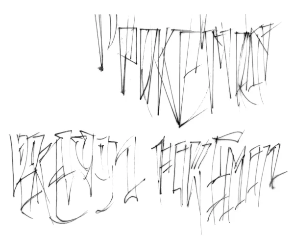
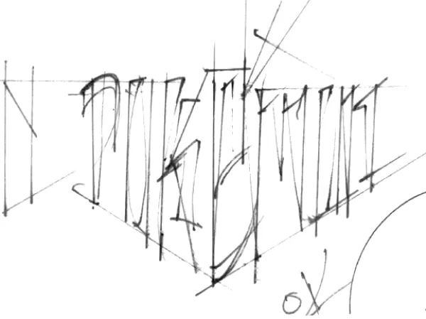
Typically, a logo project like this would take six months with multiple rounds of revisions. Nintendo’s one-month deadline, set for the Pokémon Red and Blue reveal at E3 1998, was unrelenting. But Maple thrived under pressure. He sketched numerous logo variations by hand on a light table, experimenting with letter shapes and creating several options for Nintendo to choose from.
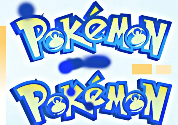
Original Pokémon Logo Sketches by Chris Maple
 View 8 Images
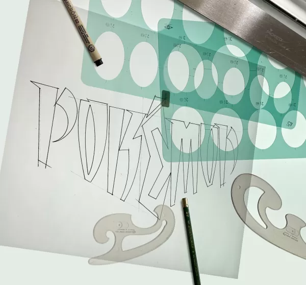
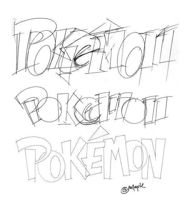
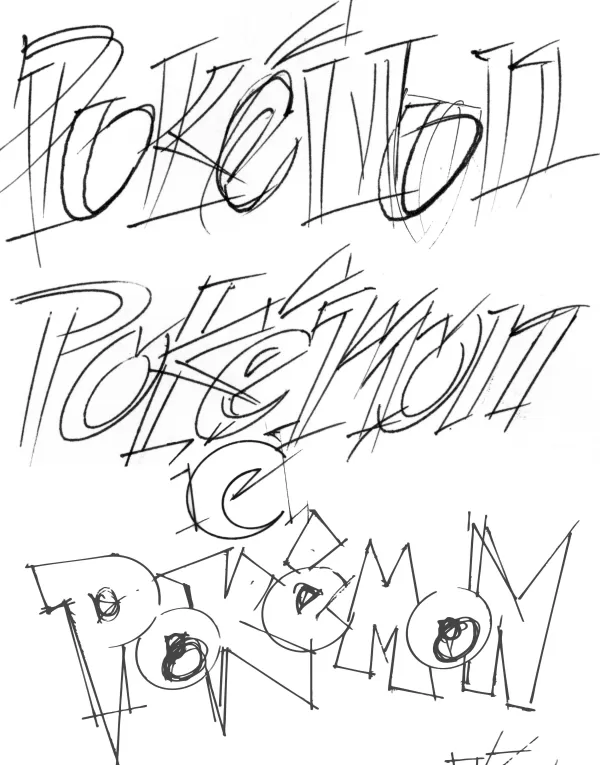
Maple had little to work with—just toys, papers, and a tiny Pikachu figurine. Nintendo offered a brief explanation of the game and showed him early monster illustrations and a draft of a Nintendo Power magazine featuring Pokémon. The logo needed to work on a pixelated GameBoy screen in both color and black-and-white. After crafting several designs, Maple presented them to Nintendo, starting with ones he liked less, which got lukewarm reactions. Then he revealed his favorite.
“The room went silent,” Maple recalls. “Then Don James, a Nintendo executive, spoke up: ‘I believe this is the one.’ He nodded, saying, ‘Yep, that’s it.’ Arakawa agreed, and I was told to produce it.”
Why did Maple and Nintendo love this version? “It’s the energy,” he says. “I tried to capture the story behind the game, its potential, and what it could become.”
Maple’s choice of yellow and blue for the logo may have been influenced by the upcoming Blue and Yellow game versions, though he says it was instinctive. “It just felt right,” he admits. “It sounds vague, but that’s the truth.”
Once approved, Maple stepped back as Nintendo handled marketing and game releases. Months later, at Toys R Us with his son, he was stunned to see his logo on a massive display with arches, TVs, and noise. “It was surreal,” he says.
A Lasting Pokémon Legacy
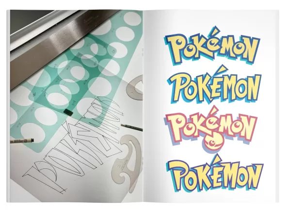
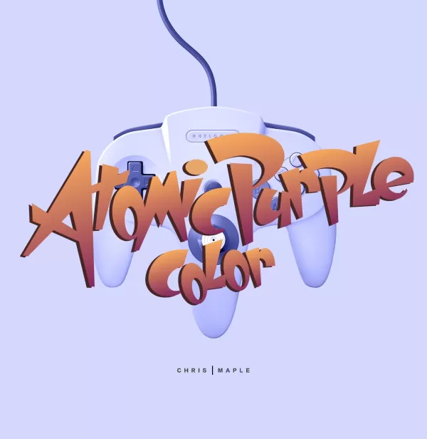
Maple’s work with Pokémon didn’t end there. Post-E3, Arakawa asked for minor tweaks to the logo’s “P” and “E” letters, resulting in the version used today. He also contributed to other Nintendo projects, including designs for Major League Baseball Featuring Ken Griffey Jr., Mischief Makers, and possibly Star Wars: Rogue Squadron, plus the Atomic Purple Nintendo 64 box redesign.
Maple dabbled in the Pokémon games but was too busy to dive deep. His son collected the trading cards until they were banned at school. “My daughter would tell people in stores, ‘My daddy made that logo,’ and moms would glare at me like I was to blame,” he laughs.
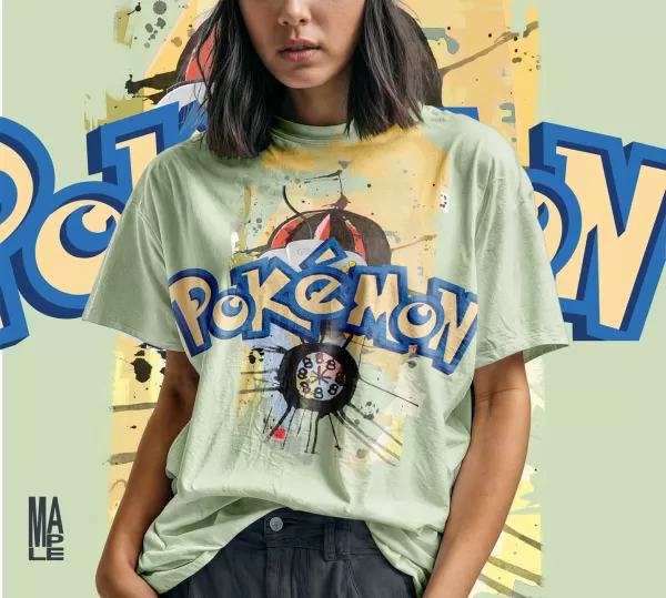
Maple’s Nintendo work eventually tapered off as the company hired in-house designers. For years, he didn’t publicly discuss his Pokémon logo role, as was typical in his industry. Recently, encouraged by his son, he’s begun sharing his story, adding the logo to his website with T-shirt mock-ups and other designs.
Why now? “After 27 years, I wanted to claim this achievement,” Maple says. “People who love Pokémon, like IGN, deserve to know the real story.”
Chris Maple Modern Mock-up Logo Images
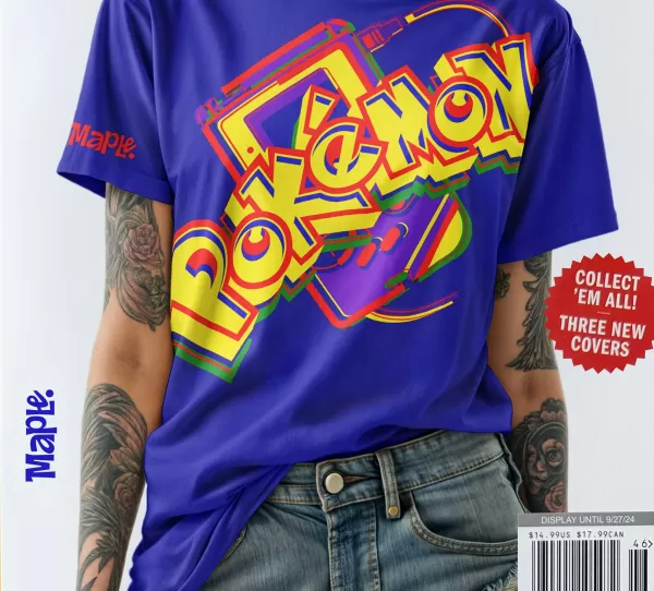
 View 4 Images
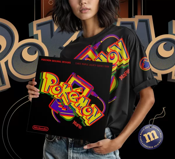
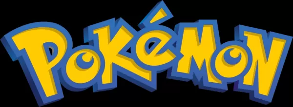
If he could redo the logo, Maple says he’d revert to the original 1998 version before the tweaks. Looking ahead to Pokémon’s 30th anniversary, he worries about potential logo alterations. “If they add ‘30th’ to it, it won’t feel right without the original thought and care,” he says. “I’d love for Pokémon International to call me to handle it. It’d be great PR.”
Maple’s brief work on Pokémon—a single logo—has left a lasting mark, appearing on everything from games to merchandise. Beyond Pikachu, it’s arguably the franchise’s most recognizable symbol.
Does he feel responsible for Pokémon’s success? “I feel good about doing it right for the kids and fans who’ve grown up with it,” he says. “When I teach kids in underserved areas and they learn I designed the logo, they go wild, asking me to draw characters. I put the logo on the whiteboard, and it’s a hit. Those moments are priceless. I’m just glad it’s still thriving.”


- 1 Roblox: Eat Pizza to Grow GIGACHAD Codes (January 2025) Feb 25,2025
- 2 All the Buttons on Fisch Can Be Found Here Dec 24,2024
- 3 Three Nights at the Blacksite Pressure Guide [April Fools] May 12,2025
- 4 Roblox Forsaken Characters Tier List 2025 Feb 14,2025
- 5 Hogwarts Mystery Character Guide - All Romance Options Explained Apr 07,2025
- 6 Top Pirate Crew Formations: Like a Dragon: Hawaii Mar 13,2025
- 7 Marvel Rivals' Controversial Hitbox System Draws Attention Feb 11,2025
- 8 Marvel Contest of Champions Champion Cards Guide Mar 14,2025

![LeMOMnade: Family Squeeze! – Version 1.1.1 [mtrellex]](https://img.3xbz.com/uploads/38/1719569762667e8d62c486e.jpg)


-
Mastering the Art of Digital Tools
A total of 10
-
Best News & Magazines Apps for Daily Reading
A total of 10
-
Hidden Gems: Unexpectedly Useful Other Apps
A total of 10